Unedited Pictures for Front Cover and Contents Page
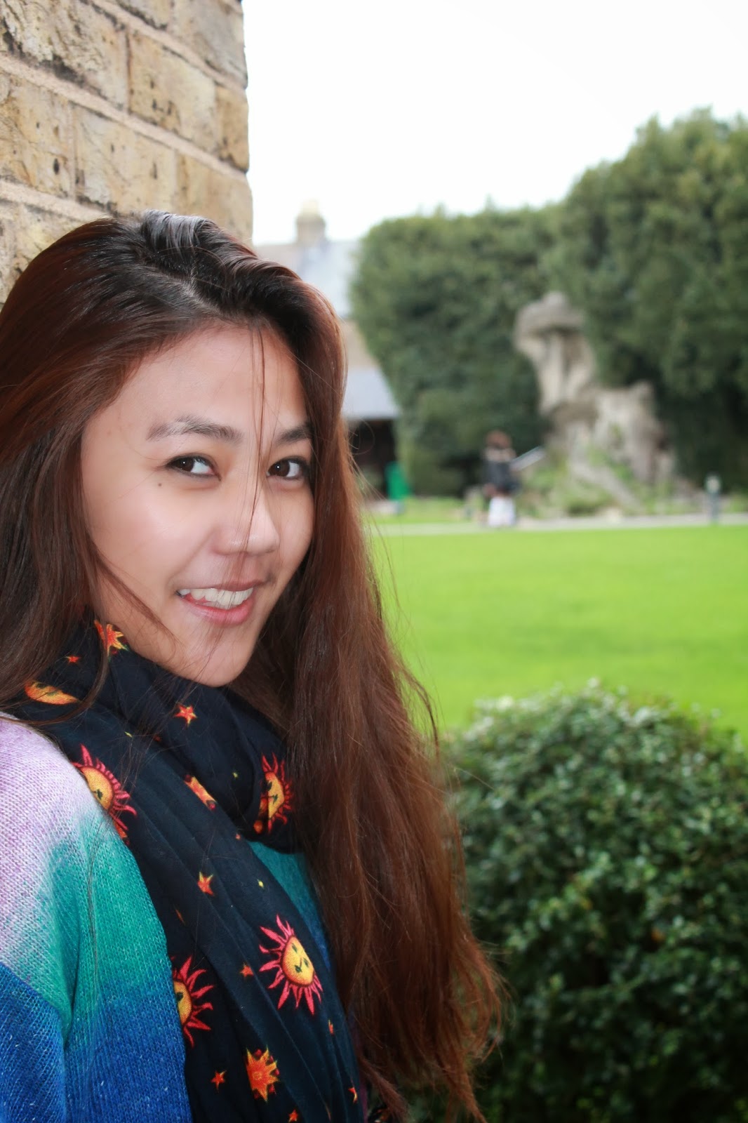
These are a couple of images that I have taken that could be used either within my front cover or contents page. This image perfectly portrays the happy nature or a pop magazine, the model is facing the camera and is clearly smiling. I am not completely certain in using this image on the front cover because the model is not centred in the image like in most front covers. In any case, the background can be covered with the headlines and the masthead of the front cover. However, as a personal opinion, I would say if this image is used, it would be the most suitable on a contents page.

Like I have mentioned, in the previous image, the problem was that the model was not centred on the picture. This seems to be a better version for a front cover, as the image concentrates more on the model rather than the background. If I would still need to concentrate on the model, I would be able to crop the image as an improvement. The only possible issue with this image would be that it does not follow the convention of the model being in a mid shot like on most front covers. However it can always be used as a sub image or on the contents page.

I would say that this image fits well with the pop magazine genre, it is quite colourful, the model is centred on the page which would suit being placed on the front cover. Because of the plain background, it would mean that I would have the ability to Photoshop the image to change around the colouring of the background too. It may seem as if this picture is a little cheesy, but I feel that it simply follows the conventions of general pop magazines on the market today. Therefore fulfilling its purpose and being applicable to the correct target audience.
These images once again portray a happy nature of a pop music magazine. I tried to test out different positioning of the model, therefore giving a bit of a variation in terms of the layout. The differentiation would mean that the image would suit the contents page either as one large image, or as a combination of sub images in addition to other pictures. The variation could be used to represent the personality of the artist for the front cover of the magazine or as visual aid in addition to the main story of the magazine.


No comments:
Post a Comment