Tuesday, 21 January 2014

DPS Draft 4


I believe that this is definitely an improvement from the previous draft. I spent more time on editing the image, and I feel that afterwards, it looks more professional. I added in more imagery and quotations after analysing more conventions of pop music magazines such as 'We love pop'. Also, I tried to split the page with an effect of ripped paper, which is something that seems to work well with the rest of the aspects on the page. However, once again, I think that I need to work on splitting the page into two halves, and maybe completing some experimentation with fonts/colour schemes.
 
How did I create the masthead of the magazine?
To create the masthead for the magazine, I went through a long process of experimentation with possible names such as beat, tempo ect. But these names didn't feel like effective ones to use. And so, after coming across many, I finally found that 'shuffle' would fit the magazine perfectly as it linked to the idea of music very well. To make the masthead more interesting, I merged a bold font with the shuffle icon with the help of Photoshop and my 'Kanvus' tablet. This made the mast head more appealing for the front cover.  
 

Double Page Spread Draft

This is my first actual attempt at designing the double page spread, I think that the general look of it is pretty appealing and there is a good colour scheme. The only thing that I have a problem with is the main image. I tried to edit the image to create an impression  of blurriness, almost as an affect of double vision. However, I don't particularly like how it turned out. As an improvement, I would try to enlarge the image, to make it spread over half of the page. Because this convention is very important for the music magazine

Tuesday, 17 December 2013

Double Page Spread Drafts


This is my first attempt at the double page spread. To some extent this was more of an experimentation for the layout and the colour. As I had mentioned previously in the sketches of the double page spread, I wanted to experiment with the pallet of colours. I took the pages to two directions, one that resembled something like sketches within a notebook, sadly it didn't include as much colour as I wanted. Therefore, within the other direction, I had another attempt, and by comparison the second double page spread is much more colourful. I would have to say that the colouring definitely followed the convention of pop magazines. Overall, I still felt that it needed a lot of improvement. This is because the layout and possibly the colour scheme would have to be altered, once the main/sub images are included.

Wednesday, 11 December 2013

Unedited Photographs for the Double Page Spread

These are the unedited pictures that I may choose to use for my double page spread within the magazine. I like the positioning of the first two photographs. The colours are quite bright, but then again, the contrast and the brightness can be altered to enhance this. The only problem, that I would have is that the floor is visible. As a solution, I would have to Photoshop the background to a single colour, and may have to use a slightly different shade for the floor to give a sense of shadowing. In the same way, I would be able to use the Photoshop program to create a background of a single colour. Thus making the image look more professional. As seen in many of the regular pop music magazines in the market today.

These images show a slightly better variation in terms of the positioning of the models or the angle that the photo was taken in. I will probably not use the 5th image . As it is a live action shot. This doesn't make it seem professional, and the general convention of pop magazines, are to have the 'celebrity' pose in front of the camera. Although, it can be used as a sub image.. In the same way, I will probably exclude the 6th image as well. This is due to the fact that the image has come out blurry, and the main image needs to be sharp.


The last image seems quite suitable for the DPS, however, I feel that the image may take too much space. In terms of the fact that it may take up 3/4 of the double page spread. Which subverts the general convention of pop magazines. In any case, if any of these images are not used as the main image for the double page spread. I would always have the chance to use them as sub images either on the front cover or the contents page.

Tuesday, 26 November 2013

Survey Results

Q1) Do you currently read any pop magazines?
The results showed that all of the people questioned do not currently read any pop magazines. This could be used to prove that the current pop magazines out on the market do not cater for people for ages of 16+. Which also gives me an opportunity to fill the gap in the market so that it would be suitable for older teens as well. 

Q2) Who is your favourite pop artist?
The answers for this question varied a lot in terms of the different pop artists, from Taylor Swift to bands such as the Wanted. The results showed that the artists were mainly in the top 40 in regards to the music charts. Therefore, a music chart is something that I could consider within my music magazine. The genres varied a little, so something I could additionally ask the target audience could be the sub genres of pop music that interest them.

Q3) What do you expect the double page spread to include?
 Most of the answers included the basics such as, headlines, subheadings, the masthead, date, page numbers, buttons. An additional thing that I could include could be a form of competition, which is what one of the replies mentioned, it could be something that would differentiate from different magazines on the market. As I have mentioned before, a chart list may be useful to include as well, so the double page spread may be the perfect place to display this information.

Q4) How long do you expect the double page spread to be?
As expected, the results of this question showed that the double page spread should stretch from 5-10 pages which is a reasonable quantity when taking into consideration that it is for a music magazine, I would say that the second option of 5-7 pages seems too little, and since I want to focus this magazine for a older target market, I would have to include a little more information. Hence, more pages for the double page spread.

Q5) Would you prefer 1 main image or several sub images on the double page spread?
The target audience revealed that in fact, using both a main image and sub images would be a good idea for the music magazine. This is because the 1 main image would follow the convention of regular magazines on the market. The use of sub images on the page as well would mean that additional key information about the artist(s) can be included. With sub images, I would be able to test out many angles and shots too.

Q6) What type of artist should the double page spread be based on?
Most of the results showed that the target audience preferred the double page spread to be based on a group or band. In some ways, that is an advantage for me, because then I would have more information to write for the double page spread as the band includes several artists. However, if I change my mind, writing about one artists wouldn't necessarily be an issue either.

Q7) What type of colouring should the pop magazine include?
Referring back to the results, the people questioned replied that bright and bold colours would be the best option. This could be because it is something generally associated with pop music magazines as it reflects the style of the music. However this is a convention, of a younger target market, therefore I may have to question the market again, using more specific options in terms of colouring.

Q8) How would you make the pop magazine more suited for young adults?
According to the results, more information seems to be key in making the magazine more suitable for young adults. This is preferably because the younger generation generally purchase the magazines for the imagery and not so much the story of the article. Some other things to consider could be colouring, layout and imagery so that the magazine doesn't seem too childish. In terms of imagery, I could keep to the conventions of using a large blown up image on one side of the page and possibly a couple of sub images to give the reader more of an insight.

Q9) Would you prefer an interview or biography for the double page spread?
An interview also seems like the most preferable option, this could be because with an interview, a lot of information can be displayed without losing the interest of the audience quickly. An interview would mean that the information can be condensed to some extent as well, so that the reader would be able to quickly find out the main points of the article.

Tuesday, 19 November 2013

DPS Article Draft

Its their first interview, yet they have enough stories to tell to make it seem like they have been in the music business for ages. So we group 'the band' together to jump straight to the questions.

So, why is the group named ‘the band’ in the first place?
Frankly, because we couldn't think of a name, all of the group members argued a lot over this. We did have some suggestions over it such as chromatic, the chords, N-Di-Go and the tropical ants. It’s actually, pretty difficult to find a name that everyone likes enough. I think that Chromatic and N-Di-Go lasted the longest, well, a performance each. Until we all decided that we hated all of them. It wasn't just that, because everyone in school always referred to us as the band, and the rest of the names never cached on, so I guess it just stuck with us.
Who is part of it and what part do they play?
There are currently 7 members of the band, and we try to include many instruments and vocal abilities within the group to improve the performances. And so, we have the three main guitarists, Amber plays the lead, Dorthea plays bass and Kim plays rhythm guitar. Then we have Charlene behind the keyboard/piano and Yvonne playing the drums. All that is left are the actual singers, Emma and Chantelle.
When was the band actually formed?
Well, in year 9 we were put together in a group by a temporary music teacher called Mr Barlow. He collected us from different music classes and we played together. He helped us arrange songs, music and so on, which led to us being able to do it on our own once he left. So really, it’s him that we should be thankful for.
What have you achieved as the band so far?
We won the best cover at Newham’s battle of the bands! We covered ‘We are young’, and we enjoyed making covers so much that we ended up playing songs at the liturgy, charity events and even the school summer and chamber concerts. Our talent didn’t just stay in school, we even performed at a couple Challenge events, and we were part of the entertainment for the community fun day in Becton as well
What are the most favourite covers you have done and why?
Well, it has to be ‘We are young’ again! We had a lot of fun with it; the thing is with covers of songs you can always change the song a little. For example, during one performance, we reggaed it up half way through the song. Charlene changed the keyboard settings to steel drums, we changed the beat and Dorthea began doing call outs with her Jamaican accent. It was really fun we all enjoy playing the song and we would love to play it again sometime. We love mash ups of songs too, like in the rewards evening we did a medley of songs including the theme song for friends. That was really fun to cover as well.
Are you going to write any songs in the near future?
Yes, definitely! In fact, we are writing a Christmas song right now, which we will hopefully play at the Carol Concert.  And hopefully, if all goes well then we will write more songs in the future.

After writing the article for the double page spread, I experienced a lot of difficulty to actually gather the group for a photo shoot, which of course plays a vital part within the magazine. Unfortunately, this left me with no other option but to change the main focus of my magazine. I was very lucky to find replacement models for the photo shoot. However, this also meant that the article and the name or the group had to be changed as it would not have linked to the new models. 

The updated article for the double page spread:

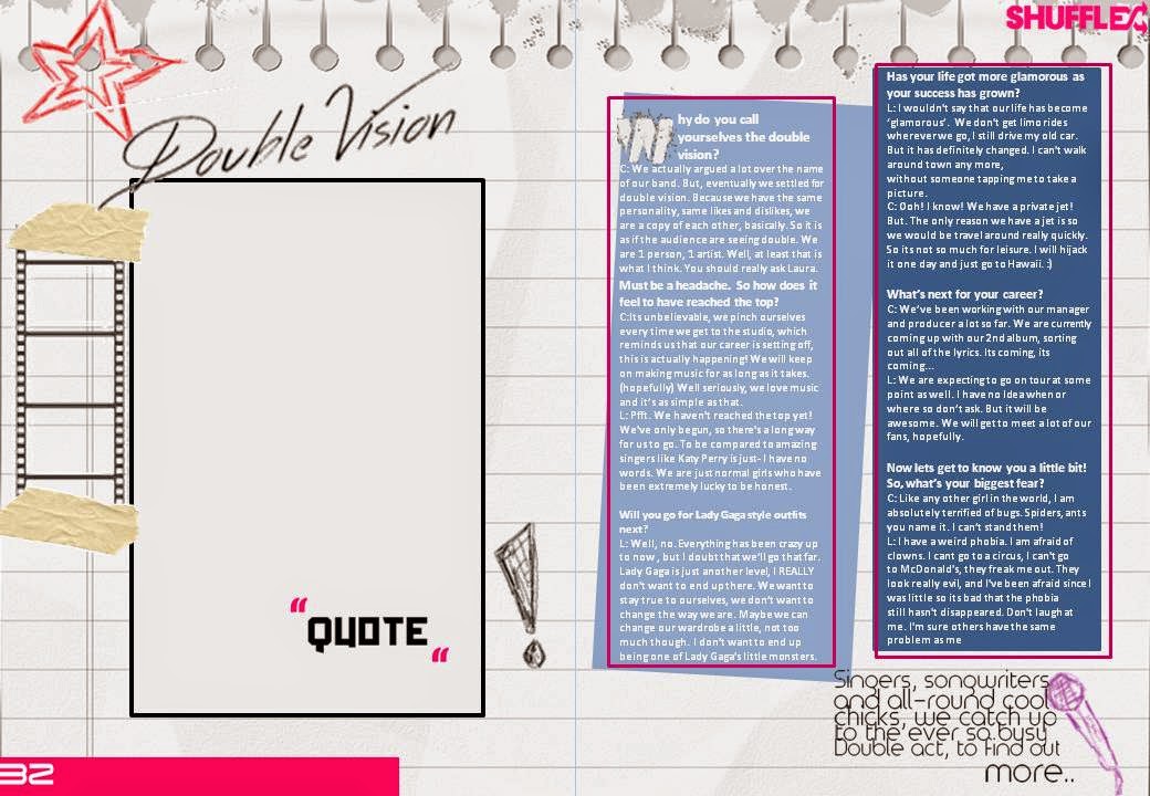
Why do you call yourselves 'Double Vision'?
C: We actually argued a lot over the name of our band. But, eventually we settled for double vision. Because we have the same personality, same likes and dislikes, we are a copy of each other, basically. So it is as if the audience are seeing double. We are 1 person, 1 artist. Well, at least that is what I think. You should really ask Laura.
Must be a headache. So how does it feel to have reached the top?
C:Its unbelievable, we pinch ourselves every time we get to the studio, which reminds us that our career is setting off, this is actually happening! We will keep on making music for as long as it takes. (hopefully) Well seriously, we love music and it’s as simple as that.
L: Pfft. We haven't reached the top yet! We've only begun, so there's a long way for us to go. To be compared to amazing singers like Katy Perry is just- I have no words. We are just normal girls who have been extremely lucky to be honest.
Will you go for Lady Gaga style outfits next?
L: Well, no. Everything has been crazy up to now , but I doubt that we’ll go that far. Lady Gaga is just another level, I REALLY don't want to end up there. We want to stay true to ourselves, we don’t want to change the way we are. Maybe we can change our wardrobe a little, not too much though.  I don't want to end up being one of Lady Gaga's little monsters.
Has your life got more glamorous as your success has grown?
L: I wouldn't say that our life has become ‘glamorous’.  We don't get limo rides wherever we go, I still drive my old car. But it has definitely changed. I can't walk around town any more, without someone tapping me to take a picture.
C: Ooh! I know! We have a private jet! But. The only reason we have a jet is so we would be travel around really quickly. So its not so much for leisure. I will hijack it one day and just go to Hawaii. :)
What’s next for your career?
C: We’ve been working with our manager and producer a lot so far. We are currently coming up with our 2nd album, sorting out all of the lyrics. Its coming, its coming...
L: We are expecting to go on tour at some point as well. I have no Idea when or where so don’t ask. But it will be awesome. We will get to meet a lot of our fans, hopefully. 
Now lets get to know you a little bit! So, what’s your biggest fear?
C: Like any other girl in the world, I am absolutely terrified of bugs. Spiders, ants you name it. I can’t stand them!
L: I have a weird phobia. I am afraid of clowns. I cant go to a circus, I can't go to McDonald's, they freak me out. They look really evil, and I've been afraid since I was little so its bad that the phobia still hasn't disappeared. Don't laugh at me. I'm sure others have the same problem as me!
Enough CLOWNING around. What is your favourite dish?
C: I'm sorry is that even a question? I just eat everything. Food is the most glorious thing in the world!
L: You are so fat! Do you see what I have to live with? We go to a restaurant, and she orders nearly everything on the menu. 
What advice would you give to an aspiring artist?
C: Personally, I would say that you should never give up. We have been shot down so many times for trying but we never stopped. Now look where we are! Making music, being interviewed for magazines, going to concerts.
L: Because if you give up, you’ll never know how far you’ve gotten. So just push on. It is difficult. I'm not going to lie. But then again, what you put in is what you get out.

Monday, 11 November 2013

Pencil Sketches of Double Page Spread

This was my first attempt of a double page spread. The purpose of these sketches was to get a better idea of the layout of the page. I think that the idea of centring the headline at the top would be a good idea, since it would draw the target audiences attention straight away. In the same way, I think that it would be quite necessary to include additional images, with the main image on the page. This would be able to display different angles, locations and editing techniques. The only thing that I am not too happy with, would be the layout. As shown above, the text would take up the majority of the page, however the conventions of pop magazines seem to be that the image has to take up half of the page. This is simply because pop magazines are usually image heavy rather than the actual text.

My second attempt took the previous issues into consideration. For instance, I experimented with the layout in terms of dividing the page more, so that the image and text are equally spaced out. I wanted the music to be the primary focus of the magazine, however, having seen this experimentation, I feel that it would be best to conform to the general conventions of focusing on the artists instead. The only thing that I feel I need to experiment more on is the colour scheme. Since these sketches only concentrate on the layout, the pallet of colours will play an important part and so I would have to experiment with this during my drafting stage.