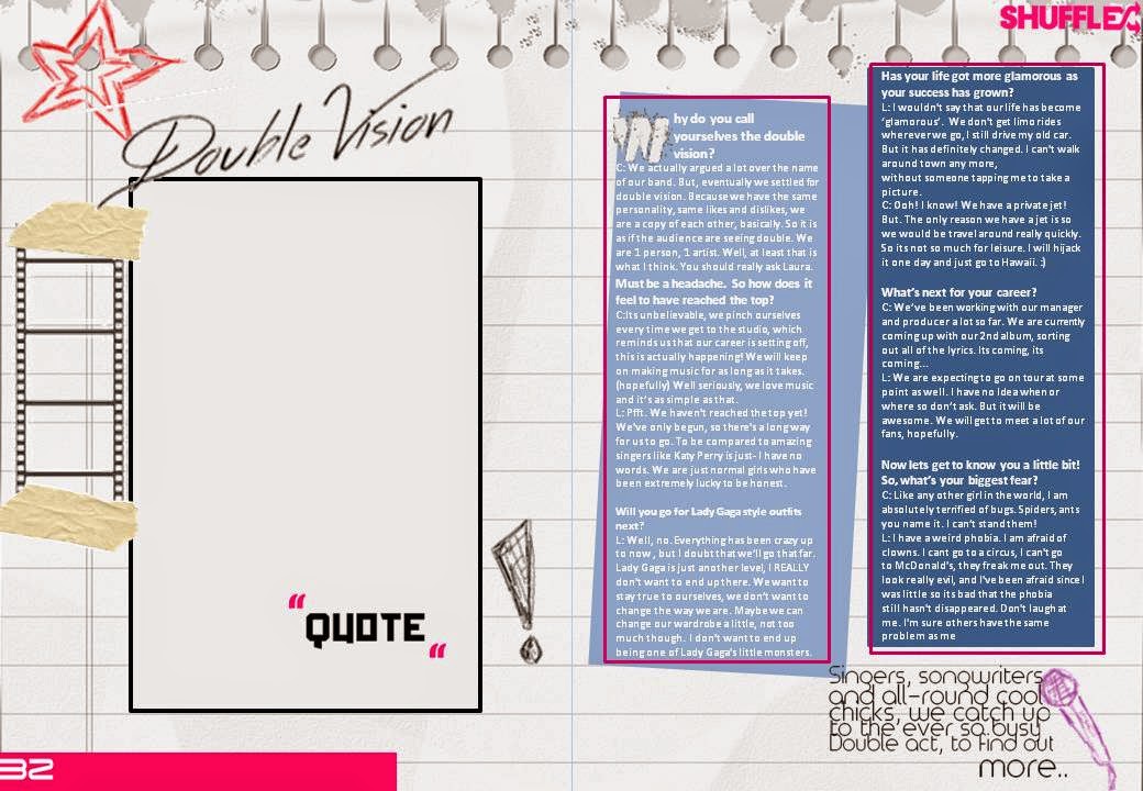
This is my first attempt at the double page spread. To some extent this was more of an experimentation for the layout and the colour. As I had mentioned previously in the sketches of the double page spread, I wanted to experiment with the pallet of colours. I took the pages to two directions, one that resembled something like sketches within a notebook, sadly it didn't include as much colour as I wanted. Therefore, within the other direction, I had another attempt, and by comparison the second double page spread is much more colourful. I would have to say that the colouring definitely followed the convention of pop magazines. Overall, I still felt that it needed a lot of improvement. This is because the layout and possibly the colour scheme would have to be altered, once the main/sub images are included.
Tuesday, 17 December 2013
Wednesday, 11 December 2013
Unedited Photographs for the Double Page Spread

These images show a slightly better variation in terms of the positioning of the models or the angle that the photo was taken in. I will probably not use the 5th image . As it is a live action shot. This doesn't make it seem professional, and the general convention of pop magazines, are to have the 'celebrity' pose in front of the camera. Although, it can be used as a sub image.. In the same way, I will probably exclude the 6th image as well. This is due to the fact that the image has come out blurry, and the main image needs to be sharp.
The last image seems quite suitable for the DPS, however, I feel that the image may take too much space. In terms of the fact that it may take up 3/4 of the double page spread. Which subverts the general convention of pop magazines. In any case, if any of these images are not used as the main image for the double page spread. I would always have the chance to use them as sub images either on the front cover or the contents page.
Subscribe to:
Comments (Atom)


